
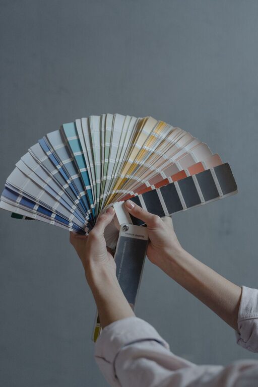
Creating a peaceful environment in your home starts with the colors you choose for your walls, furniture, and décor. Calm colors help reduce stress, promote relaxation, and make your living spaces feel welcoming and cozy. Whether you want to refresh a single room or redesign your entire home, selecting the right colors can make a big difference.
In this guide, you’ll find useful tips on how to choose calm colors that suit your style and help create the tranquil atmosphere you desire.
Why Choose Calm Colors?
Calm colors are often soft, muted tones that have a soothing effect on the mind and body. They can improve your mood, help you relax after a long day, and enhance concentration in spaces like home offices. Unlike bright or bold colors, calm hues tend to be less stimulating and easier on the eyes.
Common calm colors include:
– Soft blues
– Gentle greens
– Warm neutrals (beige, taupe, cream)
– Light grays
– Pastel shades (lavender, pale pink)
Tips for Choosing Calm Colors
1. Consider the Room’s Purpose
Think about how you use the space. Bedrooms and living rooms benefit from colors that encourage relaxation and restfulness, like soft blues or muted greens. For workspaces, you might want calming yet slightly energizing tones, like light gray or sage green.
2. Test Samples Before Committing
Colors can look very different depending on the lighting and room size. Always test paint samples on your walls and observe them at different times of the day. This helps you see how natural and artificial light affect the color.
3. Pair Colors with Neutrals
Calm colors often work best when paired with neutral tones. For example, a soft blue wall combined with white trim and natural wood accents creates a balanced and serene look.
4. Use Color Psychology as a Guide
Colors can impact emotions and moods. For calmness:
– Blue can promote tranquility and focus.
– Green connects to nature and offers a refreshing vibe.
– Beige and other warm neutrals create warmth and comfort.
Understanding these associations can help you pick colors that match the atmosphere you want.
5. Avoid Overly Saturated Shades
Bright or highly saturated colors tend to be more stimulating, which doesn’t align with creating a calm environment. Stick with muted or pastel tones to maintain a peaceful feel.
6. Consider Texture and Finish
The finish of your paint or materials affects the overall look. Matte or eggshell finishes often work well with calm colors since they reduce glare and create a soft appearance.
7. Add Calming Accents
If you prefer neutral walls, incorporate calm colors through accents like throw pillows, rugs, curtains, or artwork. This approach allows you to enjoy peaceful colors without overwhelming the space.
8. Personalize Your Choices
While guidelines help, your personal preferences matter most. Choose colors that feel right to you and reflect your style, ensuring your home feels like a true retreat.
Popular Calm Color Palettes for the Home
Soft Blue and Gray
Combining soft blue walls with light gray furniture or décor creates a cool, serene environment. This pairing works well in bedrooms and bathrooms.
Sage Green and Warm Beige
Sage green brings the outdoors inside, and when paired with warm beige, the combination feels natural and soothing. Ideal for living rooms and kitchens.
Lavender and Cream
Lavender offers a gentle splash of color with calming properties, paired nicely with cream tones to keep the room light and airy.
Light Taupe and White
Taupe is a versatile neutral that adds warmth without overpowering. When combined with crisp white trim, it creates a clean and peaceful space.
Final Thoughts
Choosing calm colors for your home is about creating a space that feels comfortable and relaxing to you. By considering the room’s purpose, testing colors, and using calming palettes, you can transform your home into a peaceful sanctuary. Remember, your surroundings influence your mood, so take the time to pick colors that help you unwind and enjoy your space to the fullest.
Happy decorating!